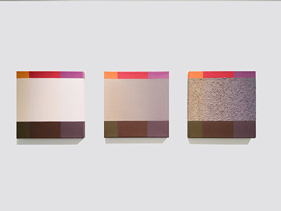
Review (via Artcritical): Siri Berg at Fiterman
Siri Berg: In Color at the Shirley Fiterman Art Center
by John Mendelsohn
For over 50 years, Siri Berg has kept faith with abstract painting, creating a body of work of rigorous and lyrical beauty. The outlines of the oeuvre of this 95 year-old artist are traced in a retrospective of thirty-three paintings, drawings, and assemblages currently at the Shirley Fiterman Art Center.
Berg was born in Stockholm, Sweden, studied at the Institute of Art and Architecture at the University of Brussels, and has lived in the U.S. since 1940. The earliest work in the exhibition is Cycle of Life, a painting from 1967, with curvilinear forms that glow and morph in a swimming mass. It is distinctive among all the paintings for its sense of biomorphic animation. But it has qualities found throughout Berg’s work: form as an expressive, poetic medium, and color as a sensuous experience.
The circular forms of Cycle of Life recur in many of the works from the 1970s, including Progressions #3, with rows of circles that wax and wane like phases of the moon. This same sequence moves within the large painting Diptych (phase 22), with a similar palette of gray discs that become orange in five steps. In the smaller, intense La Ronde,figure and ground change from red-purple, brown, and red, to ochre, deep yellow, and lemon.
The sense of cosmic mysteries and the music of the spheres, found in many works from the 1970s, is most strongly present in the nocturnal Bottom Circle, in which a small dark disc partially eclipses a larger paler sphere, extracting from geometry a kind of mythic drama. This sense of the abstract at the service of an inner necessity is a living reality in Berg’s work, through a shifting series of modes and motifs, all inflected by both the lessons of the Bauhaus and the minimalism of the 1960s.

